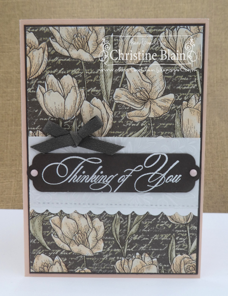
The sentiment, from Go To Greetings, was white heat-embossed on Early Espresso card, and cut with a Seasonal Labels Die. I embossed a strip of vellum with an Elegant Eucalyptus 3D embossing folder, and stuck it onto a piece of Basic White card that has a scalloped border thanks to a Penned Flowers Die. A couple of Petal Pink Solid Faceted Gems, and a bow made from Early Espresso Faux Suede Ribbon, were my embellishments of choice.
Next up on tonight's blog hop is Catherine Proctor. If you click on the button below, you'll be taken to her blog:
If you come across any broken links, or would like to see a full list of who's taking part in the Early Espresso blog hop, head over to Catherine Proctor's blog. Cathy does a fantastic job of co-ordinating our weekly Colour Creations blog hops.
Listed below are all the products I used to make my card. If you live in Australia, and would like to shop with me for your Stampin' Up! supplies, you can get to my online store by clicking on any of the thumbnail images below.


Oh that scripty font looks fabulous with the gorgeous white tulip DSP with the scripty background, Christine. I love the tiny touch of Pink in the Solid Faceted Gems. Such a soft and feminine card using a very masculine colour.
ReplyDeleteA beautiful card Christine. I love, love, love it. Your colouring is delightful and Wink of Stella would be showing it off beautifully. I love Petal Pink with Early Espresso together and combining it with Crumb Cake is perfect. Xxx
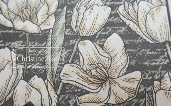
ReplyDeleteYour pink, glimmery tulips look fantastic! Early Espresso is definitely not a colour that I think of as feminine, but your gorgeous card has turned that thinking upside down.
ReplyDeleteLoving the Petal Pink and Early Espresso colours and your colouring of the flowers seem to make them pop from the darker Early Espresso background. Christine I love the sentiment you chose especially the font - beautiful!
ReplyDeleteSuch a lovely feminine card for such a bold colour. Those tulips look so soft and I can imagine the Wink of Stella for highlights. The sentiment font is absolutely perfect for your card.
ReplyDeleteOnce again, blogspot won’t let me enter my name . . . . Your card is stunning Christine, I love every detail you have blended together so nicely! Hugs, Kathryn R xx
ReplyDeleteA gorgeous combination of soft and dark tones together, Christine. Your colouring of the DSP is lovely, and what a perfect sentiment to coordinate with the script on the patterned paper. Stunning!
ReplyDeleteVery pretty with the delicate colouring on the DSP. Abigail Rose paper was a hit this week with a number of the team, it seems!
ReplyDelete