This week's Colour Creations blog hop features creations, from a number of us who are Stampin' Up! demonstrators in Australia, in Evening Evergreen. This beautiful dark green is one of the 2021-2023 In Colors, in Stampin' Up!'s range.
Evening Evergreen and Soft Succulent are two of my favourite greens for Christmas creations this year. I have, however, used them in a different way, to create a masculine birthday card, using the fabulous Lighthouse Point bundle. The neutrals I included on my card are Very Vanill and Crumb Cake.
The bokeh-patterned paper, from the Lights Aglow DSP pack, evokes thoughts in my mind of a stormy sky or sea ... just go with me, and this creative licence I'm employing! I die-cut the larger of the two lighthouses in the die collection, using Soft Succulent card for the solid lighthouse, and Evening Evergreen card for the striped overlay. Very Vanilla and Crumb Cake were used for the top parts (after I'd cut off the Evening Evergreen top).
I stamped the sentiment, from Inspired Thoughts, in Evening Evergreen ink on Very Vanilla card, and cut it out using an All That Die. I ran this piece back through my Stampin' Cut & Emboss machine a second time, having moved the die a little, to make the sentiment label smaller whilst still keeping the shape.
The embellishments added to the top of my card front are Evening Evergreen Opal Rounds.
The bottom third of my card front is Crumb Cake Designer Series Paper. I laid some Natural Finish Ribbon across the join of the two different patterned papers, and used Glue Dots to add a knot made from the same ribbon. I tucked under the ribbon a Basic Borders Die-Cut, in Evening Evergreen card.
The rocks around the base of the lighthouse were stamped in Crumb Cake ink on Crumb Cake card, then cut out using the co-ordinating die.
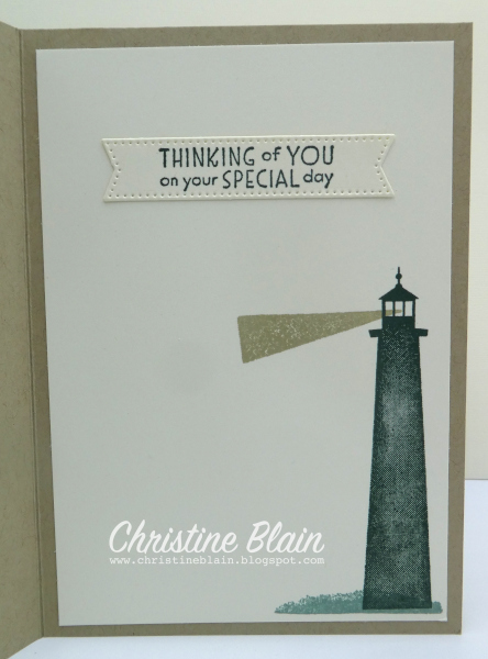
To the inside of the card, I added a Very Vanilla card panel. I stamped a lighthouse in Evening Evergreen ink, with a Crumb Cake "light beam", and Soft Succulent grassy bank. A second birthday sentiment, also stamped in Evening Evergreen ink using Inspired Thoughts, was added. I cut out this sentiment with a Stylish Shapes Die before adhering it.
Next up on this week's blog hop is Diane Furniss. Click on the button below to be taken to her blog:
If you come across any broken links on the blog hop, or would just like to see a comprehensive list of who's taking part, head over to Catherine Proctor's blog. Cathy does a fantastic job every week of co-ordinating our Colour Creations blog hops.
Listed below are all the products I used to make my card. If you live in Australia, and would like to shop with me for your Stampin' Up! supplies, you can get to my online store by clicking on any of the thumbnail images below.
Product List


")


 Specialty Designer Series Paper")
 Designer Series Paper")


 Ribbon")
Great card Christine - I never would have thought to use the lighthouses with this colour, but I love what you have done with it, and the "bokeh" paper was a great choice! Kind of like all the lights bouncing off the water.
ReplyDeleteChristine, I love your use of the bokeh-patterned paper, from the Lights Aglow DSP pack for a stormy sky or sea - it looks fantastic. I also think it evokes the light of the lighthouse in the sky. That sentiment from Inspired Thoughts is just perfect - you've totally nailed another masculine card!
ReplyDeleteAmazing! I never would have thought to use this colour for a lighthouse but it works really well! A great combination of elements.
ReplyDeleteYour masculine Lighthouse card is amazing Christine. I love the use of the bokeh design from the Lights Aglow DSP. It does evoke a sense of dark stormy seas. Your lighthouse elements work so well together and the sentiment is a perfect choice. Xxx
ReplyDeleteLove it Christine! Such a dramatic choice of colour and image, and they work together beautifully.
ReplyDeleteI had the same thought about the bokeh paper, and also thought that the zig-zag border looked like a distant mountain range. Both work so nicely with the the lighthouse on your fabulous card.
ReplyDeleteYes, the bokeh paper really does look like a stormy sky, that was a great choice, Christine. The lighthouse is amazing in greens and the entire scene is beautifully composed.
ReplyDelete