Every Monday night for the next few months, a group of us will be showcasing Stampin' Up! products to use in your Christmas crafting.
Tonight I have a couple of simple Christmas cards to share. I have used the Nests of Winter Designer Series Paper, and a few other co-ordinating products, that will be available in the upcoming Mini Catalogue that goes live in a few weeks. I have created two cards that would be easy to make multiples of (if you're so inclined!).
CARD #1:
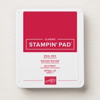
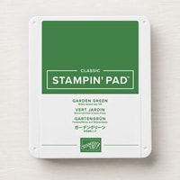
Starting with a Real Red card base, I added a Garden Green card layer. The bird-patterned paper is embossed with the Birch Wood 3D embossing folder.
Here's a closer look at the embossed detail:
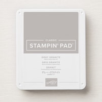
For the sentiment panel I cut a strip of one of the other patterned papers in the Nests of Winter pack. It's a birch pattern, to complement the embossed pattern on the top paper. I sponged the edges of both DSPs with Gray Granite ink, and adhered them to the Garden Green panel. A thin strip of Real Red card was added to the join between the papers.
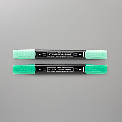
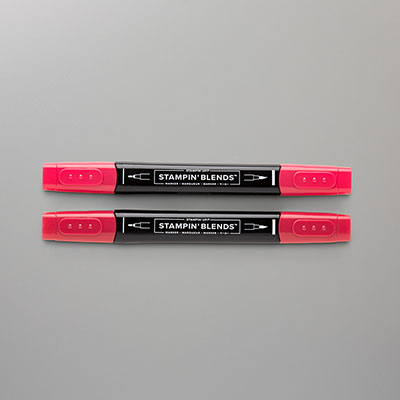
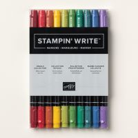
On a piece of Gray Granite card, I stamped the bough, and cut it out with the co-ordinating die, using the Winterly Tree Tops bundle. I coloured the image with Shaded Spruce and Real Red Stampin' Blends markers, and my Garden Green Stampin' Write Marker.
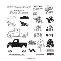
The sentiment, from Trucking Along, was stamped directly onto the Designer Series Paper, using Real Red ink. I added a few Earth Tones Shimmer Gems to complete my card front.
Inside the card I added a Basic White card panel, decorated with a bird die-cut from another piece of Nests of Winter DSP.
CARD #2:
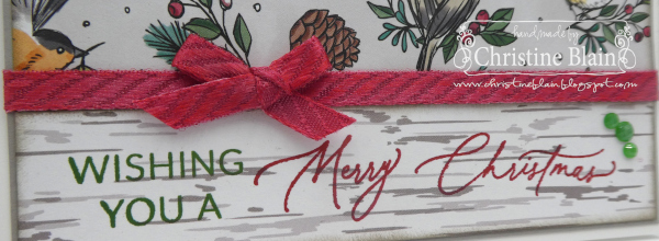
This card is my favourite of the two. I'm not as drawn to the red and green colour combination, as I am to neutrals with splashes of those two colours.
I have used the same two patterned papers as on my first card, but in a landscape orientation. This time the papers are matted on a Gray Granite panel, and a Thick Basic White card base.
The ribbon dividing the two patterned papers is White Diagonal Trim, that I have coloured using my Dark Real Red Stampin' Blends Marker.
The sentiment was created with two stamps from Greetings of the Season - one stamped in Garden Green ink, and the other in Real Red ink.
Earth Tones Shimmer Gems finish off this card, too.
Next up on tonight's blog hop is Judy May:
Product List






Two beautiful cards, Christine, that showcase a beautiful DSP! These designs would be perfect for mass producing at Christmas time. I love the subtle texture the embossing gives to the DSP.
ReplyDeleteLove both of your cards Christine! That's such a cute piece of DSP and I love the detail added by the embossing. Simple but beautiful!
ReplyDeleteTwo beautiful cards Christine, lovely use of two different DSP sheets, they work perfectly together. I too prefer the second card with the white and grey base.
ReplyDeleteBoth cards are really lovely, Christine and perfect to showcase the beautiful paper. I think the second is my favourite too, with the lovely pop of the red ribbon.
ReplyDeleteTwo beautifully simple yet lovely cards that as you say can easily be mass produced. You've let the beautiful papers do all the talking. Even though your second card is your favourite I actually prefer the first one as the embossing adds another depth.
ReplyDeleteBoth lovely cards, Christine, but I like you, am more drawn to card 2. I think it is that gorgeous ribbon and bow that you have coloured with the Real Red Blends and the landscape layout.
ReplyDelete