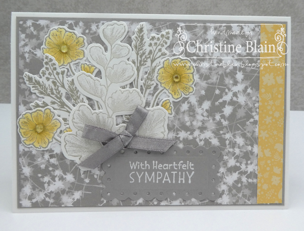
This week's Colour Creations blog hop is showcasing Gray Granite, one of the greys in Stampin' Up!'s colour range. It is a slightly brownish-grey, that I think of as a good colour to use on masculine cards. For tonight's blog hop, though, I have softened it with So Saffron; I think these colours together make a nice sympathy card.
The background papers are from the Sun Prints Designer Series Paper pack, and the Subtles 6"x6" DSP pack.
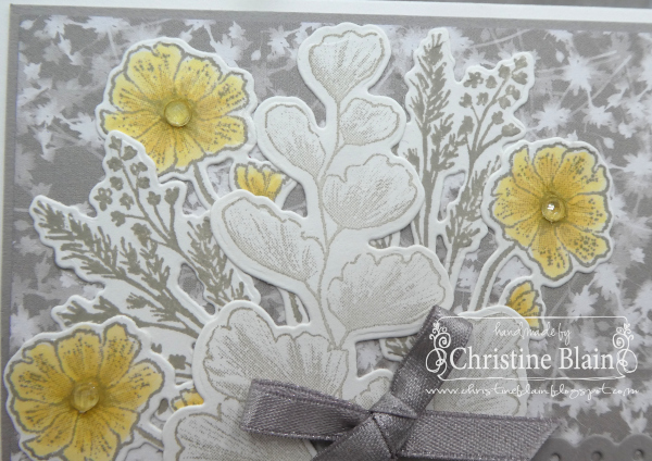
The stamped floral and leafy images are from Nature's Prints. I stamped them all in Gray Granite ink on Basic White card, and die-cut them using the co-ordinating dies.
To achieve a softer colour for the largest stamped piece, I applied Gray Granite ink to my stamp using a Blending Brush. The other images were stamped full-strength, inked directly from the inkpad. The flowers are coloured using So Saffron Stampin' Blends markers. I added Elegant Faceted Gems to the flower centres.
Next up on tonight's blog hop is Catherine Proctor. Click on the button below, to be taken to her blog:
If you come across any broken links on the blog hop, or would like to see a full list of participants in the blog hop this week, head over to Catherine Proctor's blog. Cathy does a fantastic job of co-ordinating our Colour Creations blog hops.
Listed below are all the products I used to make my card. If you live in Australia, and would like to shop with me for your Stampin' Up! supplies, you can get to my online store by clicking on any of the thumbnail images below.
Product List


What a clever idea to apply the ink to a stamp with a Blending Brush. It looks fantastic - I will have to remember to give it a go. Your card is lovely, the addition of So Saffron was a great choice for a sympathy card.
ReplyDeleteChristine, your application of Gray Granite ink using a Blending Brush gives a wonderfully soft effect to the large stamped image. This card is the best card I've seen using the Sun Print DSP and it works so wonderfully well with the soft Saffron too - great colour combo!
ReplyDeleteUtterly gorgeous card my friend! Favourite colour combination and I love the way you’ve stamped and coloured the images for such such subtle variation.
ReplyDeleteKathryn R. xx
A delightful card Christine. I love grey and yellow together and so love your colour combo. Great use of the Sun Prints DSP with the coordinating stamps. Beautiful. Xxx
ReplyDeleteA lovely card with the softened Gray Granite, perfect for the purpose Christine.
ReplyDeleteSuch a pretty soft toned card, Christine, perfect for a sympathy card. Gray Granite and So Saffron are lovely together. I had never thought to ink the stamp using the blending brushes, great tip!
ReplyDelete