Showing posts with label Sanded. Show all posts

Tuesday, March 22, 2011

JUST ADD INK #60 - CARD FOR A GUY

I wanted to challenge myself, to not include any flowers or butterflies, on my second entry for this week's Just Add Ink challenge ..... these colours work so well for both of those beauties of nature, don't you think?


One of the new stamps that is coming out in Stampin' Up!'s Autumn/Winter Mini (released 1st April), is Motorcycle.  One of my brothers is a diehard Harley rider, so I HAD to have this stamp.  Here's what I've done with it:


Stamps: Motorcycle (*available 1st April), Party This Way, Sanded, Well Worn
Card: Crumb Cake, Old Olive, Whisper White
Ink: Crumb Cake stampin' pad, Old Olive stampin' pad, Rich Razzleberry stampin' pad and marker, Jet Black Staz-on inkpad, Basic Black stampin' pad, Basic Gray marker
Other: Blender Pens, Mat Pack and paper piercing tool, Colour Spritzer tool, Word Window punch, Modern Label punch, sponge dauber, Linen Thread, edge distressing tool, stampin' dimensionals, Crop-a-dile, Jumbo eyelet (Pewter)

Wednesday, March 16, 2011

INKSPIRATIONS CHALLENGE #61

Just a super-quick post tonight, as I'm about to watch the episode of "Farmer Wants A Wife", that I recorded while waiting for hubby to come home to watch it with me.  Who doesn't love a bit of romance, hey?  ("Farmer Wants A Wife", that is, not hubby coming home.)

Here is Makeesha's sketch for this week's Inkspirations Challenge:


I was inspired today to get out my Autumn Days stamp set, that had yet to see ink.  Armed with my trusty Colour Coach, I used the colour combination of Always Artichoke, Cajun Craze and Perfect Plum.  Here's what I made, using this sketch:


Stamps: Sanded, Autumn Days, Teeny Tiny Sentiments
Card: Always Artichoke, Confetti White, Cajun Craze
Ink: Always Artichoke stampin' pad and marker, Cajun Craze and Perfect Plum stampin' pads
Other: Mat Pack and paper piercing tool, Word Window punch, 1 3/4" circle punch, Circles #2 dies, sponge daubers

Wednesday, November 17, 2010

CURTAIN CALL COLOUR CHALLENGE #56

This week at Stacey's Stamping Stage, the challenge is to use the following gorgeous colours together in a papercraft project:


I found this colour combination really enjoyable to work with, and came up with another friendship card (that I get so much pleasure out of making, and giving!).  Shocking photography, but I hope you can see it well enough.


Stamps: Sanded, Bella Toile, Hello Again, Friends 24-7
Card: Pear Pizzazz, Whisper White
Ink: Pear Pizzazz, So Saffron, Peach Parfait stampin' pads and markers, Chocolate Chip stampin' pad
Other: Peach Parfait poly-stitched ribbon, Top Note die, Perfect Polka Dots embossing folder, Nestabilities, stampin' sponge, mini glue dots, 3/8" circle punch (*NEW* in upcoming Summer mini)

Saturday, October 16, 2010

JUST ADD INK #39

October is a busy month, for raising awareness of issues that I have close personal experience with.  As well as being Breast Cancer Awareness month, this month is  Anxiety and Depression Awareness Month.


Over a million people in Australia alone live with depression. Over two million have an anxiety disorder. With the right treatment, most people recover.  I count myself amongst the lucky ones.

beyondblue Anxiety and Depression Awareness Month provides an opportunity for workplaces, community groups and individuals to take part in activities to raise awareness of anxiety and depression, and help reduce the associated stigma.  It's easy to help raise awareness. Sometimes the simplest acts have the greatest impact - just talking openly about anxiety and depression helps reduce the stigma.  You can find out more at beyondblue.org.au

This week's challenge over at Just Add Ink is "Just Add Blue ..." I really LOVE colour challenges, but I have to say this one really was a challenge for me; I don't often use blue in my paper-crafting, and it is definitely not one of my "go to" colours.  Having said that, in my determination to add blue to the palette of colours I use in my card-making, I did recently buy Stampin' Up!'s new "Blueberry Crisp" Designer Series Paper.  I seriously love these papers!!  I like the 'denim-y' look of some of the papers (check out the little butterflies on my card). 


Do you like the wide 'flower' that the sentiment is matted on?  I was pretty pleased with myself, for making this!  It is made from three of the large flower, from the new Birds & Blooms Sizzlits die.  I placed the flowers behind the oval, and cut off the excess petals so the flowers sat nicely around the edge of the oval.  I used my fingernail to rough up the petals a little, and pinched them to curl upwards.  A few drops of Crystal Effects were added, to give the look of dew on the petals.

Here are the 'ingredients' for making this card:

Stamps: Sanded, Sincere Salutations
Card: Sahara Sand, Pacific Point, Very Vanilla
Ink: Sahara Sand, Not Quite Navy, Pacific Point stampin' pads
DSP: Blueberry Crisp Designer Series Paper
Other" Birds & Blooms sizzlits die, Wide Oval punch, Beautiful Wings embosslits, mat pack and paper piercing tool, Basic Pearls, sponge daubers, Very Vanilla 1/8" taffeta ribbon, Crystal Effects, Tombow multi-purpose liquid glue

Monday, September 20, 2010

EXTREME ELEMENTS for Ethan

Today my 'baby' is having a milestone birthday - he's 10!!  I'm trying not to be all soppy, and lament the loss of all the past cuteness, but I must say I am struggling a bit with my littlest growing up.

I'm having great fun with my new "Extreme Elements" stamp set, and right from when he saw this creation, Ethan requested that I use the stamps on his birthday card.  (Darn it, there goes my idea of a cutesy owl card.)  I think every time I use this stamp set, I like it more and more.  Here's what I came up with, using some of the fantastic fresh, new, colours from Stampin' Up!


Stamps: Extreme Elements, Perfect Punches, Sanded
Card: Early Espresso, Marina Mist, Whisper White, Cajun Craze
Ink: Early Espresso, Marina Mist and Cajun Craze stampin' pads, Soft Suede marker
Other: Star Punch, Wide Oval Punch, Early Espresso button (from Neutrals assortment), Colour Spritzer tool, sponge daubers, mini glue dots, paper snips

HAPPY 10th BIRTHDAY, Ethan!  Love you, buddy xx

Saturday, August 7, 2010

"ART WITH HEART" TEAM BLOG HOP - MEN IN OUR LIVES

Hi all

Today is a very exciting day for me - not least of all because it's time for another blog hop with some of my wonderful Stampin' Up! team members.  IT'S MY BIRTHDAY!!  21, again :)

As a Leo, it's a little difficult for me to accept that it's not "all about me", but I'll move on and talk about the blog hop, which is probably why you're visiting my blog today!

Being the first Saturday of the month, it's time for our "Art With Heart" team blog hop. This month our theme is "Men in our Lives". We hope to inspire you with our male-focussed projects, for Father's Day, birthdays, or just celebrating the males who are special to us.
The "Art With Heart" team of Stampin' Up! demonstrators comprises over 90 women, spread across Australia, and is led by Claire Daly (based in Melbourne). We have a very active online team forum, that is a great source of inspiration, support, and friendship. If you'd like to join us, whether it be as a hobby demonstrator (to receive great discounts, every day, on Stampin' Up! products), or to start up your own rewarding, home-based business, please email me; I'd love to have you join our friendly team!

As with each of our blog hops, we offer *blog candy* - a little prize for one person who visits all of the participating blogs, leaves a comment, then emails Nikki Sadler to confirm that all blog posts have been commented on. The offer for the blog candy is valid only for 72 hours from the launch of our blog hop; so, to be in to win, make sure you email Nikki by 6.00am AEST Tuesday 10th August. Blog candy cannot be won by Stampin' Up! demonstrators, but we would dearly love for you all to visit our blogs and leave comments anyway!

Today there are 9 of us taking part in the blog hop. You may have come from my talented friend Judy May's blog, or may be starting off here.  Either way, it's lovely to have you visit - thank you!  When you've finished looking at my blog post, just click on the link below to go on to Tina Gillespie's blog. You can start at any of the blogs along the way; you'll do a 'circuit', and cover all 9, as long as you follow the links on each blog.


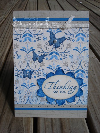
Now, onto my projects. I have chosen to make a couple of Father's Day cards, using the wonderful sentiment from my Occasional Greetings stamp set, that's on page 112 of the Stampin' Up! catalogue.  This set contains a great variety of sentiments, including greetings for Mother's Day and Father's Day - I love it.

I really love the colours in this first card that I have to share with you.  Let me know which is your favourite!

Stamps: Occasional Greetings, Sanded, Party Hearty
Card: Kiwi Kiss, Whisper White, Basic Gray
Ink: Kiwi Kiss and Basic Gray stampin' pads
DSP: Urban Garden, Urban Oasis
Other: Basic Gray corduroy buttons (retired), dimensionals, White gel pen, sponge daubers, mini glue dots, edge distresser


Some of the things that I like to use often on male cards are Jumbo Eyelets, Weathered background stamp, and paper piercing/edge distressing.  Here's a simple card that incorporates all of these elements:


Stamps: Occasional Greetings, Weathered
Ink: Basic Gray, Baja Breeze
Card: Basic Gray, Baja Breeze (smooth and textured), Whisper White
DSP: Urban Garden Designer Series Paper
Other: Mat pack and paper piercing tool, Jumbo Eyelets (set with a Crop-a-dile), Top Note die, sponge dauber, dimensionals


Finally, I'd like to share with you a project dedicated to a young man who is very special to me.  The scrapbook page below includes two of the most important males in my life - Andrew (hubby) and Jack (our eldest son).  In April, Jack went on his first overseas cricket tour, representing the Yarra Valley (in Melbourne's outer east).  Such an auspicious occasion - I had to scrap it! 


Here's a close-up of the journalling:


Hmm, now that I see it on screen, it's not exactly crystal clear - sorry!  The hand-written journalling reads:

"Jack, we were incredibly proud that you, at 14, were selected as part of the Yarra Valley under-17s team touring Sri Lanka and Malaysia.  This photo was taken just before you headed off to the airport.  You and Dad had a fantastic trip.  We're sure you will go on to great things with your cricket, son.  We're with you every step of the way!"

Another couple of close-up shots, so you can see the stamped background (the Just Cricket stamp set gets quite a work-out in my house!):


Here's a list of products used to make this layout:

Stamps: Just Cricket, Starring You
Card: Kraft 12x12, Summer Sun, Whisper White textured, Brilliant Blue
Ink: Versamark inkpad, Brilliant Blue stampin' pad and stampin' write marker
Other: Curly Label Punch, Corner Rounder Punch, Mat pack and paper piercing tool, Brilliant Blue brads, title rub-ons (not SU!)


I hope you have enjoyed seeing my projects for this month's blog hop.  Next on the 'tour' is Tina Gillespie, who will no doubt have someting very creative to show you.  Please check out all 9 blogs on the hop, and leave some comment love!  Don't forget you can win a prize by emailing Nikki after you've commented on each blog.

I've included below a complete list of all the participants in today's hop, so that if you lose your way, you can refer back to it.


Christine Blain (that's me, the birthday girl!)http://www.christineblain.blogspot.com/


Tina Gillespie
http://scissorspapercard.blogspot.com


Kristine Thompson
http://inkspotcreations.typepad.com


Nikki Sadler
http://inkyart.com.au


Dianne Dunk
http://www.stampartbydi.typepad.com


Alisha Watson
http://www.ratherbstampin.typepad.com


Sue Madex
http://www.madexcreations.com


Kathryn Ruddick http://www.katlodesigns.com


Judy May
http://www.judymay.typepad.com/

Sunday, August 1, 2010

JUST ADD INK #28

The fabulous team at Just Add Ink have come up with a double challenge this week - to incorporate these yummy colours


in a man's card.  Now, that in itself is not really a challenge, because I love making cards for men and boys, and these are some of my "go-to" colours.  However, in the process of making my card I learnt the value of "less is more".  I'll explain.  I had a very clear vision in my head of what I wanted this card to look like.  You know, simplistic design, grungy and distressed looking background, bit of edge distressing and some faux stitching (all staple elements in many of my male cards). 

I started off with a panel of Kraft card, and stamped the Sanded background in Sahara Sand.  Nice, subtle, texture, and I should've left it at that.  But, no, I decided to over-stamp it with Sanded again, in Baja Breeze.  Hmm ... not quite the look I was going for.  I applied a bit of Chocolate Chip ink with a sponge, to my stamp of choice (the brocade image from Friends 24-7), to give a subtle, masculine look to one side of the card.  In an attempt to cover up the Baja Breeze stamping I'd regretted, I stamped Sanded AGAIN, this time with Chocolate Chip ink.  This detracted from my subtle brocade-y pattern, so I stamped the brocade bits again with full-strength Chocolate Chip ink.  Now the card just look imbalanced, so I proceeded to stamp the brocade pattern all over my card (with ink sponged onto the rubber, so it wasn't toooooo dark).

What I've ended up with is a card that very nearly got thrown in the bin.  However, because I've been rather short on "stamping just for fun" time, I decided to share my creation with you instead!  I'm hoping I'll get a chance in the next few days to make another card that is more to my liking.

I don't have my grandfathers any more, but my boys do, so one of them might just be lucky enough to receive this card one day, LOL.


Oh, to top off the "this isn't working out as I'd planned" experience, when I stamped "Wonderful", I got a small line of ink where I didn't want it.  Hence the lightly ruled line underneath that word - it was an attempt to salvage the Baja Breeze panel.  There are no mistakes in stamping ... just creative opportunities!

Here's what I used to make this card:

Stamps: Sanded, Friends 24-7, Wonderful Favourites
Card: Kraft, Chocolate Chip
DSP: Parisian Breeze and Baja Breeze Patterns Designer Series Papers
Ink: Sahara Sand, Baja Breeze and Chocolate Chip stampin' pads, Chocolate Chip stampin' write marker
Other: Stamp-a-ma-jig, Jumbo brads, mat pack and paper piercing tool, sponge dauber, edge distresser

Wednesday, June 9, 2010

INKSPIRATIONS COLOUR CHALLENGE #26

I have been a regular stalker of Makeesha Byl's blog for a looong time now, and love the regular challenges she throws down.  Finally, I have decided to enter one myself - I do love a challenge with my cardmaking.

How could I NOT enter, when this week's challenge is to use the following colours on a project??

Makeesha-colour-challenge-26-1

These colours make me swoon!!  I have so many ideas for incorporating them in my cards, but for my first entry I've made a birthday card for my Dad.  I am uncharacteristically organised, as my father's birthday is still two weeks away .... feels good to have it done already.


Dad's bday card 2010

Stamps: Sanded, Polka Dot, Occasionally, On Your Birthday

Card: Kraft, Basic Gray, Whisper White

Ink: Sahara Sand stampin' pad and marker, Basic Gray stampin' pad, Real Red stampin' pad

Other: Stamp-a-ma-jig, Curly Label Punch, sponge dauber, 5/16" white brads (from Neutrals assortment), paper piercing tool, linen thread
  

Saturday, May 22, 2010

Turquoise ASIAN ARTISTRY bird

You know I'd mentioned that at my last stamp group I had watercoloured a few images from the new "Asian Artistry" stamp set from the Autumn-Winter Mini catalogue?  Well, I'm not through with showing you my card series yet!  I've made a really simple card, using the bird image that I had watercoloured in Tempting Turquoise.  This card was made using a sketch from my Stampin' Up! team's online forum; actually, the same sketch that spawned my Cameo Coral and Rose Red watercoloured rose card.  Just goes to show what different cards can result from one sketch!  I like this card better; the clean lines, and bold colour ... much more to my liking!


Asian Artistry turquoise bird

Stamps: Asian Artistry, Sanded, Teeny Tiny Sentiments

Card: Tempting Turquoise, Basic Gray, Watercolour Paper

Ink: Basic Gray stampin' pad, Tempting Turquoise stampin' pad and marker

Other: Basic Gray taffeta ribbon, Basic Gray corduroy button (retired), aquapainter, Word Window Punch, mini glue dots

Thursday, May 6, 2010

"GREENHOUSE GARDEN" Get Well card

My dear friend Kerry let me borrow her  "Greenhouse Garden" stamp set, that is not available in Australia.  It is such a gorgeous set, and I have been hanging on to it for weeks; I thought I'd better make something with it, before I give it back to Kerry tomorrow!

One type of card that I (thankfully) don't have much need for, but which I'd like to have in my stash 'just in case' is Get Well cards.  I have a couple of creations in the pipeline ... I'll share the Greenhouse Garden one with you today, and will post the other tomorrow.

The oranges that I've used in this card are Apricot Appeal (LOVE the softness of that colour), and the much bolder Pumpkin Pie.  To soften the solid background card, I have stamped it in Very Vanilla using the Sanded background stamp, then have sponged around the card edges with Very Vanilla ink.

Even though this beautiful stamp set is not in our current Stampin' Up! range, I wanted to share my card with you, because I really like it - hope you do too!


Get well card orange

Stamps: Greenhouse Garden, Sanded, Sincere Salutations, Vintage Vogue

Card: Pumpkin Pie, Very Vanilla

Ink: Very Vanilla craft stampin' pad, Apricot Appeal, Pumpkin Pie and Old Olive stampin' pads

Other: Top Note die, orange rhinestone brads, Wide Oval Punch, sponge daubers, Very Vanilla 5/8" grosgrain ribbon, Apricot Appeal 1/4" grosgrain ribbon, dimensionals

Monday, May 3, 2010

FIFTH AVENUE FLORAL

The new Manhattan Flower Textured Impressions embossing folder from Stampin' Up! has rekindled my love for the Fifth Avenue Floral stamp set. Let me explain.

The roses created by using the embossing folder co-ordinate beautifully with the large rose stamp in Fifth Avenue Floral.  I know, that's obvious, but I have taken a look with fresh eyes at the stamp set that has not received much love from me lately!  I've also revisited some of my unloved Designer Series Papers ....the same rose pattern features prominently on the Urban Oasis papers.  At this point you're probably thinking "okaaaaay, tell me something I don't know".  I'm not sure I can do that!  I'm just pleased that a few beauties that I had forgotten about for a while are back in the forefront of my mind.

On the weekend I had a few of my stamping friends over for a Mother's Day card class.  We made three projects, ostensibly with a Mother's Day theme, but, since most of us don't need more than one or two Mother's Day cards, we switched around a sentiment or two.  Since I've rabbited on a bit about Fifth Avenue Floral, I thought I'd share with you what we made with one of the flower stamps from that set.  Here's the card, and a list of ingredients:


Fifth avenue floral mother's day card

Stamps: Sanded, Fifth Avenue Floral, Occasional Greetings

Card: Pale Plum, Whisper White

Ink: Pale Plum and Rich Razzleberry stampin' pads

Other: Wide Oval Punch, Top Note Die (cut using the Big Shot), Whisper White taffeta ribbon, sponge dauber, dimensionals, Pale Plum marker (to colour the centres of the Pale Plum flowers)


To complement this card, we each made a cute little pillow box, to hold a small gift (perhaps some earrings or a necklace, or a couple of small chocolates) ... here are the card and pillow box together, followed by the products used to make the pillow box:


Fifth avenue floral plum card & pillow box

Stamps: Sanded, Fifth Avenue Floral

Ink: Pale Plum and Rich Razzleberry stampin' pads

Other: Pillow Box Die (and Big Shot), Sticky Strip, Rich Razzleberry Polka Dot grosgrain ribbon


Now, I mentioned that I've also rediscovered my Urban Oasis Designer Series Paper.  I have let the paper 'do the talking' in my next card, as I think it is just so beautiful.  I've added a few co-ordinating accents, since Stampin' Up! does them so well.  See how I've stamped the rose from Fifth Avenue floral on the tag?  LOVE how that co-ordinates with the pattern on the paper.


Fifth avenue floral anniversary card

Stamps: Fifth Avenue Floral, Teeny Tiny Sentiments

Card: Kiwi Kiss, Basic Black, Whisper White

Ink: Kiwi Kiss and Basic Black stampin' pads

Other: Urban Oasis DSP, black brads (from Vintage selection), Kiwi Kiss satin ribbon, Sizzlits Lots of Tags die (used in Big Shot), sponge dauber, kitchen string, mini glue dot


Even though I've been a bit gushy, I hope I've inspired you to take a look in your (no doubt vast, like my) stamp collection and show a bit of love to some of the stamps that might not have been used for a while. 

Monday, April 19, 2010

JUST ADD INK #13

I decided last night that it is waaaaay past time that I played along with a challenge at Just Add Ink.  This week it is a colour challenge, using the following colour combo:


JAI13 colour combo


I thought these colours would be perfect to use with my rather neglected Inspired By Nature stamp set.  The Barely Banana daisies turned out really pale, which I loved.  I decided there was too much 'white space' on my main panel of Very Vanilla card (the neutral I chose to use), so got out my Colour Spritzer tool and splattered Chocolate Chip all over the place.  I don't mind the result, although next time I'd probably go a little less heavy-handed!  I like to tell myself that handmade cards aren't meant to be 'perfect'; they have to have their little flaws. That's why it's also okay to have my sentiment not centred in the word window panel (I was planning to add a button, then changed my mind, after I'd stuck everything down), LOL. 

Here's my card, followed by the list of products used:

JAI13 CARD

Stamps: Sanded, Inspired by Nature, Teeny Tiny sentiments

Card: Chocolate Chip, Barely Banana, Kiwi Kiss, Very Vanilla

Ink: Kiwi Kiss stampin' pad, Barely Banana stampin' pad and marker, Chocolate Chip marker

Other: Word Window punch, Perfect Polka Dots embossing folder, sponge daubers, 5/16" Chocolate Chip brads, Sizzlits Lots of Tags (Label 1), Colour Spritzer tool, Walk in the Park designer series paper (retired)
  

Monday, February 22, 2010

HAPPY MOMENTS .... AND ANOTHER BIRTHDAY!

This coming week is a busy time for birthdays, in both Andrew's and my families.  Today is my brother-in-law's birthday ... I'm a little late making his card, but figured that would be okay because we'll be seeing him in a couple of days for his Mum's birthday (we don't all get together too often, so it'll be a great catch-up).  Yes, my mother-in-law is turning 70 this week, as mentioned in my earlier post.  In between the two, my nephew is celebrating his birthday.  So, I will have yet another birthday card to share with you tomorrow!

For now, I'd like to share with you the card I made (for my brother-in-law) using my favourite retired Designer Series Paper, called Parisian Breeze.  I've been holding onto it, not wanting to use it (since I won't easily be able to get my hands on more) ... but, really, I think it might take me a while to work my way through two whole packs, so I may as well get some enjoyment out of it!  The focal point of this card is the stack of presents, from the Sale-A-Bration set (that you can get for FREE if you purchase $100 of Stampin' Up! product) called Happy Moments.  I love the versatility of this image.  I've white-embossed it on kraft (oh, come on, it's DAYS since I did that!), coloured the top present with a Chocolate Chip marker, and paper-pieced the other two presents.  The middle one is cut out of Baja Breeze card, that has been stamped with the Sanded background stamp (in Baja Breeze ink), and the bottom present is paper-pieced from Parisian Breeze DSP.

I stamped a small piece of Chocolate Chip card, with the Sanded background stamp inked in Chocolate Chip, and punched out two 1/2" circles, to make Build-A-Brads.  I liked the look of them with a matte surface, so didn't use the epoxy sticker that normally completes a Build-A-Brad. 

GEOFF'S BDAY CARD


Here's a close-up of the presents, and the brads:

GEOFF'S CARD CLOSE-UP

I am loving the Sanded stamp, especially for masculine cards.

Here are all the ingredients I used for this card:

Stamps: Sanded, Happy Moments (Sale-A-Bration set), On Your Birthday

Card: Kraft, Chocolate Chip, Baja Breeze

DSP: Parisian Breeze (retired)

Ink: Chocolate Chip stampin' pad and marker, Baja Breeze stampin' pad, Versamark inkpad

Other: White embossing powder, 1/2" circle punch, Build-A-Brads, 5/8" Chocolate Chip grosgrain ribbon, sponge dauber, Stamp-a-ma-jig, dimensionals, rectangle nestabilities, edge distresser